
Stickyboard v2.0 is a major new release and is now in final review. If everything goes well, we hope to have it in your hands by next week. We are really excited about the new features, and believe they will take Stickyboard to the next level of usefulness.
The first thing you will probably notice about the new interface is the addition of a toolbar across the top:

There are 3 selectable tools: The Notes Stack (which you already know and love), the marker, and the eraser. When the Notes Stack is selected, tapping on the screen adds a note. You can also pan and zoom in this mode, and active Expose.
Select the Marker Tool to draw free-hand on the board, and select the Eraser to erase them. Pro tip: The Eraser tool erases a larger area when you are zoomed out, so use that to erase faster and zoom in if you need a little finer control.
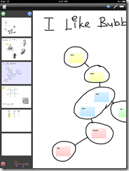
We’ve found that the Marker adds a whole new dimension to using Stickyboard. It’s great for everything from simple written annotations, to brainstorming:
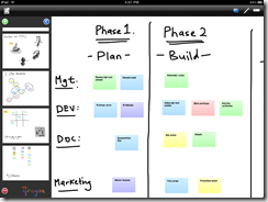
scheduling:
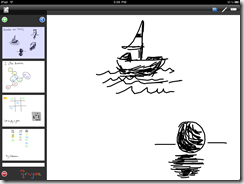
sketching:
and even drawing prototype mockups:
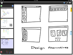
We’ve been able to pretty much do anything with Stickyboard that we used to with our regular whiteboards.
Stickyboard also works great with a stylus
We’ve made sure that the marker is very finger friendly, and we’ve also tested it with a variety of styluses. If you are planning on getting a stylus, be careful to get one that has a smooth tip that is suitable for writing, not just tapping. Many earlier styluses sold for the iPhone have rubbery tips that have too much friction to be useful for writing or sketching. We’ve been really happy with the Pogo Sketch, which works great with Stickyboard.

We’ve found that the stylus does make precise writing and drawing straight lines a little easier:


Building your own stylus
If you are more into DIY, you can try building your own home-made stylus. The iPad has a capacitive touchscreen, which detects the small electrical signal from your finger. This means that whatever you use needs to conduct electricity from your hand to the screen. We’ve built a cheap stylus using a wet cotton swab, tin foil, and ballpoint pen case using the simple instructions here. This works pretty well, but the downside is that you need to wet the cotton swab before you use it (it then works for quite a while though).
An alternative method that does not require regular re-wetting is to use a sock that has silver thread. These guys have apparently built one with pretty decent results.
UI Tweak: Removing the Done button
Remove an existing UI element??! That’s crazy! This was a decision that we debated quite a bit about. The problem with the location of the existing done button is that we’ve found ourselves accidentally hitting the backspace key when trying to tap Done. The iPad’s virtual keyboard appears to have a virtual strike-zone feature that dynamically expands the tap-zone for certain keys based on the input pattern. The zone for backspace seems to be expanded immediately after typing, and can overlap with the toolbar above.
We considered a variety of alternative solutions, including repositioning the toolbar to the top of the screen, or rearranging the buttons to the center. However, we found these alternatives to clutter up the screen too much.
In the end we realized that the iPad keyboard already has a built in Done button! It’s the “hide keyboard key” at the lower right:
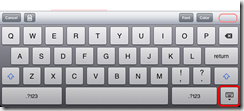
This has the exact same effect has hitting the done button, and is much more consistent across different apps. So we decided to simply remove the done button altogether. We left the Font and Color buttons in the same locations because hitting them immediately after typing does not result in mistypes. However, you may still need to wait a (very) short while right after typing for them to register correctly.
This UI change has the potential to confuse existing users (who may not read this blog), so we are a little apprehensive. It also takes a few minutes to get used to hitting the hide-keyboard key instead, but once we did it is now second nature to us.
So, this is quite a risky design decision on our part, but in the end we believe that this will result in a better and more consistent experience.
Stickyboard v2 should be available soon!
We hope that you will enjoy the new features. Please do write to us and let us know what you think and how you are using Stickyboard. Our goal is to produce a tool that you will find useful for your daily work. Let us know if there are any other capabilities that you would find useful and would like to see in a future release.