
We built Inkflow to make visual thinking easier, to bring the ease of pen and paper into the iPad age. The thing is, even we still find ourselves using pen and paper a lot. It’s hard to give up our Moleskine notebooks and G2 pens. How can we use both paper and iPad better together?
Inkport: Copy and Paste from the Real World
Inkflow Plus v3 includes a powerful new feature called Inkport. Inkport uses the iPad’s camera to scan high-resolution images of your written notes and instantly converts them into Inkflow’s native vector ink. Once on your iPad, you can edit, rotate, resize and rearrange things as if you had drawn them in Inkflow.
Inkport lets you go from paper to iPad without missing a beat.
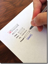
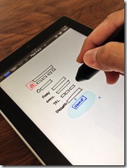
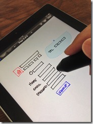
Check out this video of Inkport in action:
Think across boundaries. See a shape or pattern in a book you like? Use Inkport to pull it into Inkflow and incorporate it into your designs. Easily combine notes and drawings from different notebooks.
Inkport works well across a variety of handwritten and printed media, and is optimized for dark inks on light colored paper. Like to think in color? No problem, Inkport works with colored inks too.
We’re pretty sure Inkport is going to change the way you use pen and paper in your workflow. What used to require scanning in your notes, then spending minutes tweaking filters in Photoshop can now be done instantly, right on your iPad. Spend more time on your ideas, not on your tools.
More Creature Comforts
Inkflow 3 also includes a slew of interface and feature enhancements that make it even easier to use. You can now directly access your .inkflow files via iTunes. iPad users also get an adjustable wrist guard, and the ability to set text style defaults.
For those of you who have upgraded to Inkflow Plus, thank you so much! In addition to Inkport, we’re adding the ability to rotate photos in Inkflow 3, with a cool new rotation snap feature. Also, by popular request, is a new menu option to flip ink.
Let’s look at these additional features in a little more detail:
iTunes File Sharing
For those of you with a lot of Inkflow books, iTunes File Sharing is a powerful way to manage your files directly. To access your books, open iTunes, select your device, then click on Inkflow in the Apps tab. Each book is stored in it’s own .inkflow file. You can copy these books to your Mac for backing up, or to another iPad, iPhone, or iPod Touch with Inkflow installed.
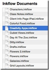
Tip: You can even access your files wirelessly using WiFi syncing in iTunes.
Wrist Guard (iPad)
A number of you guys have asked for a dedicated wrist guard for the iPad. In Inkflow 3, you’ve now got one. Our design challenge was to add an easy-to-use wrist guard without cluttering up the interface or being too distracting. Here’s what we came up with:
You’ll notice a new faint gray tab at the lower right of your screen. Pull it up to show the wrist guard. Drag it up and down to adjust the wrist guard height. You can also tap on the tab to quickly toggle the wrist guard display.

For folks who don’t want to use the wrist guard, and would prefer a little less on-screen clutter, you can disable it in the settings menu from the Gallery.
Text Defaults (iPad)
Tired of changing from left-aligned 48pt Helvetica Regular? The text editor toolbar has a new option to set the default font style. Set up any combination of font, font-weight, alignment, size, and color you want, then tap on the new Favorite Style button (with the star icon), and select “Set As Default Style”. All newly added text will have this style.
You can also change the currently edited text’s style to match the current default with the second option: “Reset to Default Style”. This is also a handy way to quickly copy the style from one text box to another.

Photo Rotation with Rotation Snap (Inkflow Plus)
We have been planning on adding the ability to rotate photos for a while, but wanted to get the interaction design just right. There are some interesting subtleties about rotating images: You generally want to rotate images at regular, compass-point, increments… Except when you don’t. You also want to be able to straighten images that are slightly off center. We could have added an extra menu option to do this, but thought long and hard about how to combine the two operations. The outcome is, what we think, a unique rotation snap tool:
Rotating images is easy enough, just select one or more images, including ink if you like, and drag the round rotation grip as before. What’s new is that you’ll notice 8 or more round snap guides appear around the circumference of rotation. Dragging near to these guides to snap to the 8 compass points. You can also drag your finger farther away to rotate to an arbitrary angle. Ink and photos now rotate together, so you can easily keep your annotations pinned to your photos when rotating.
If you select an image that has been rotated to an arbitrary angle, you will see an additional snap point that will snap that image back to it’s original, upright rotation. This lets you easily straighten images without an extra piece of UI.

Flip Ink (Inkflow Plus)
Inkflow’s signature selection tool has always allowed you to easily scale and stretch ink. One limitation until now has been you couldn’t create a mirror image of the selected ink. We have actually been thinking long and hard about this. We originally tested the ability to skew ink in reverse, i.e. to stretch it into a mirror image. That is a pretty cool interaction, but the problem is that it takes too much space to snap the image into an exact mirror image.
We finally settled on adding a context menu option to quickly flip ink horizontally in place. To use it, just select some ink, tap on the selection, then select “Flip Ink”:
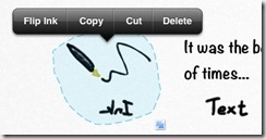
How about flipping ink vertically? No problem, just flip it horizontally, then use the rotation snap feature to turn it 180 degrees. These two new features work really well together. You can now easily create repeating patterns and tessellation effects of your work.
Making Thinking Just a Little Easier
Inkflow’s goal continues to be the best tool for visual thinking. Even as features like Inkport blur the lines between analog and digital, we have worked hard to capture the freeform essence of writing on paper, but updated for the digital world. What makes writing on paper a wonderful experience is how unrestricted and unencumbered it is. While we continue to add features and adjustments to Inkflow, way beyond what pen and paper can do, we are being very careful not to detract from this kind of experience.
Inkflow Plus v3: Free for All Existing Plus Users
At some point in the future, we will probably have to release a paid upgrade to a new codebase, but for now, we really like providing these major updates for free. It’s a way to thank you guys who have already upgraded.
There’s a raging debate about how independent developers should charge for major updates. The truth is, we go back and forth on this issue a lot. On one hand, the single paid upgrade is simple and clean. No need to worry about buying additional features one-by-one or being “nickel and dimed”. The problem is that it’s hard to keep the lights on if all you do is issue free updates. :) That is, unless your user base keeps growing.
The magic economics of free upgrades work when you genuinely love our Apps and tell other people about them. We really, really appreciate all the tweets and blogs you guys have written. It means a great deal to hear about someone enjoying our Apps, and it really helps us in a real and tangible way. It’s win-win all the way.
So if you enjoy these new upgrades, please consider taking a minute to rate us in the App Store (each version gets a separate rating). Also, please do tell your friends and colleagues about us.
Thanks, and stay creative!