Apple’s WWDC 2013 logo has intensified the speculation about the new look of iOS 7. It sports a rail-thin font above what look like flat-colored App icons wriggling around.
For months, the rumor mill has been predicting a dramatic move to so-called flat design for iOS, similar to that Microsoft did with Metro. Like every other App developer, we have been playing around with flat design for our future interface language, particularly in the use of thin fonts. Here are some findings:
1. It’s all about the Retinas
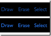
The Retina display is what makes thin font designs possible. Take a look at a light vs. regular variant of a font sized for a non-retina display:

Notice how faint and blurry the light version looks. However, when it is pixel doubled for a retina display, the same font looks gorgeous:

The lesson here is that App developers will need to programmatically switch between retina and non-retina versions of their text-based UI to maintain a good experience on non-Retina devices, at least until the iPad Mini gets it’s Retina upgrade.
2. Text can be better than icons
When your text labels look this good, they can start replacing icons for controls. Here’s the problem with icons: They are different in different Apps. Users need to re-learn and associate the meaning of every new icon they see with common functions. This results in a steeper learning curve. Through years of training, we are actually remarkably fast at recognizing words. Certainly faster than trying to guess the meaning of a new icon.
The other benefit of text is that they can also easily fade into the background and aren’t as distracting as a row of colorful icons. Think of the menu bars used for years on your desktop OS. This allows us App designers to intentionally add more conspicuous UI elements that can pop out without being overly garish themselves.
3. A flat interface enhances content
For those of us who build creativity Apps, having a flat design competes less with your content. The effect is quite remarkable, as it lets your content take center stage. There’s a reason why most photo Apps already tend to adopt a dark and non-descript UI. This lets users focus on what they should be focusing on: Making their content look great.
This move away from skeuomorphism also lets Apps be more authentically digital. UI doesn’t have to be constrained by arbitrary “real-world” limitations. A classic example: When you try to make the pages in a digital notebook look like a real paper book, it becomes a very messy operation to do “non-real-world” things like insert a new page in the middle, or duplicate a page.
Hopefully, Apple will take this opportunity to lead the rest of us with their own authentically digital designs. What do you guys think? Is everyone looking forward to a big refresh?